META VR UX
WHO
WHAT
HOW
META VR users and VR enthusiasts
Improving the interaction design in Meta's Home Menu
By mixing 2D (screen) and 3D (spatial) interactions
CONTEXT
Having owned a Meta Quest 2 and being a regular user of the ecosystem that Meta has to offer, I've had my fair share of delights and frustrations while using the various interfaces in VR.One in particular would be the home menu in the Meta Quest headsets.
PROBLEM
The problem arose after being exposed to other interaction models in various VR games and applications that utilises physical interactions, which I felt heightens immersion.
Meta home menu adapts many of their interaction behaviour from traditional 2D "point-and-click" screen interactions. Though this is an efficient and proven model, I took this opportunity to explore how it can be augmented with other interaction models in the pursuit of balancing immersion and convenience.
ISSUES
  1. My inexperience in coding, which made me pick up Unity and C#.
    Thankfully with the help of ChatGPT, the learning journey was much smoother. However, do note that the prototype seen below is graphically awful and serves as a proof-of-concept.
  2. Rapid prototyping or testing in VR can be time-consuming due to the need to wear the headset. Though Unity has a keyboard and mouse simulator, it is not the best option for testing.
REDESIGN
OVERALL CONCEPT
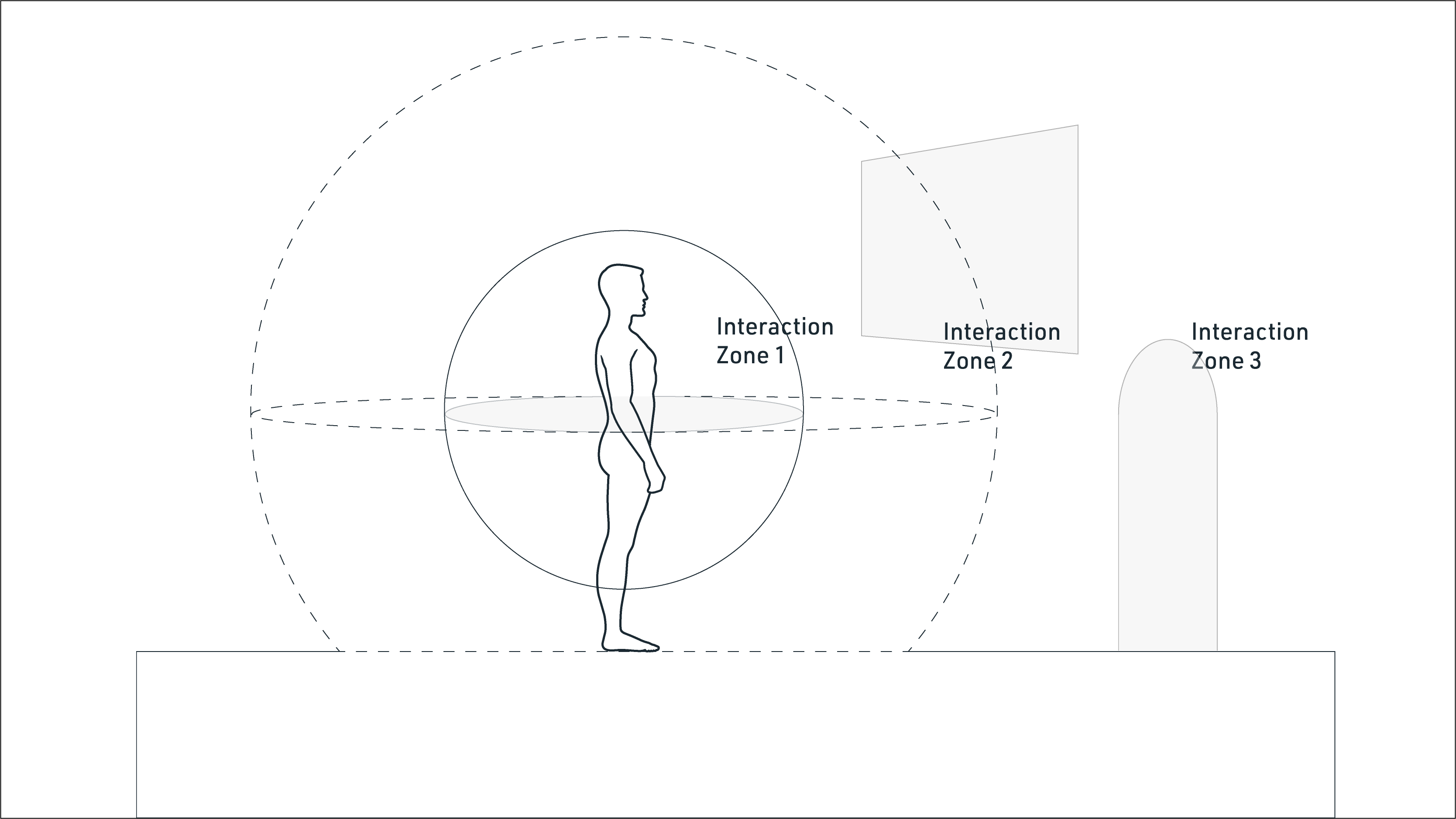
Different behaviours for each interaction zone
By splitting the virtual space into different zones, we can apply interaction types specific to each zone.
Interaction Zone 1 :
"Real-world" interactions and interactable objects.
Interaction Zone 2 :
Point and Click interactions using controllers as a cursor.
Interaction Zone 3 :
VR Avatar movement using movement stick.
REDESIGNING...
THE DOCK
Vacation Simulator - A lesson in interaction
With Vacation Simulator, I learnt the importance of physical interactions, visual cues and feedbacks in order to increase immersion.
Lesson 1 :
Some physical interactions like grabbing, pulling and throwing translates well into VR.
Lesson 2:
Other physical interactions like pushing/pressing/typing or pointing, do not. This is largely due to a lack of physical feedback.
Lesson 3:
Importance should be placed on visual cues that references physical objects (e.g handles) and visual feedback to reduce ambiguity.
Current behaviour in Meta home UI
Utilising a more traditional point-and-click interaction with the controllers may lead to some shortcomings.
Shortcoming 1:
Natural hand jitter paired with small icons will lead to fatigue and inaccuracy
Shortcoming 2:
Point and Click interactions using controllers as a cursor, though convenient, lacks immersiveness.
Application of physical interactions
Using a concept of an expandable dock with handles corresponding to Interaction Zone 1 to increase immersion and intuitiveness.
Slide 1 - Grab handles
Using clearly marked handles that are able to be grabbed and moved.
Slide 2 - Extending and Minimising the Dock
Having a dock that allows it to be minimised to allow users to enjoy the space.
REDESIGNING...
THE WINDOWS
Current behaviour in Meta home UI
Point and click interaction on icons. This either opens a window in the environment, or an application that brings you away from the home environment.
Shortcoming 1:
Windows and applications are not clearly differentiated.
Shortcoming 2:
Minimising and closing status indicators are not well shown.

Docks and Drawers - An extension to house windows and applications.
By splitting the virtual space into different zones, we can apply interaction types specific to each zone. We start with redesigning how windows behave.
Slide 1 - Minimising a window.
Using the grab handle to open and close the "lid" of the window, using design cues that are present in reality.

Slide 2 - Opening a new window.
Using a drawer to store windows and applications, grabbing and dropping to the dock to open windows


REDESIGNING...
THE APPLICATIONS
Current Meta home UI Behaviour
There are no differences in interaction between windows and applications. On click, the application will run and the environment and dock fades away.
Applications - A portal into a new space.
Application "tokens" can be thrown and upon landing, open a portal to the desired application which the user can walk through. This serves as to give an element of fun and also differentiate between windows and application.
REDESIGNING...
TYPING
Current Meta home UI
A point and click typing experience has a high rate of error, decrease in typing speed and increased fatigue when attempting to type long sentences.
CutieKeys by Normal VR with additional text display by me
By no means an innovation on my part, I've done slight modifications to the existing design here.
Benefits 1:
Text display on keyboard provides confirmation of inputs without repetitive head movement to check inputs.
Benefits 2:
Using a drum concept for interaction improves typing speed and experience.
THOUGHTS
This attempted redesign still have more areas of improvement, such as a visual overhaul and also diving into other interactions such as the UI of the windows (i.e the Shop or Browser window)

This project attempts to find a balance between immersion and convenience, that certain interactions benefit from physical interactions even though it might not be the most efficient. At the same time, it was the perfect opportunity for me to play around with the Unity's XR kit.